Principles of Art: A Practical Guide with an Original Diagram
Understand balance, rhythm, emphasis and other principles of art through original diagrams, focused studies and a practical worksheet.
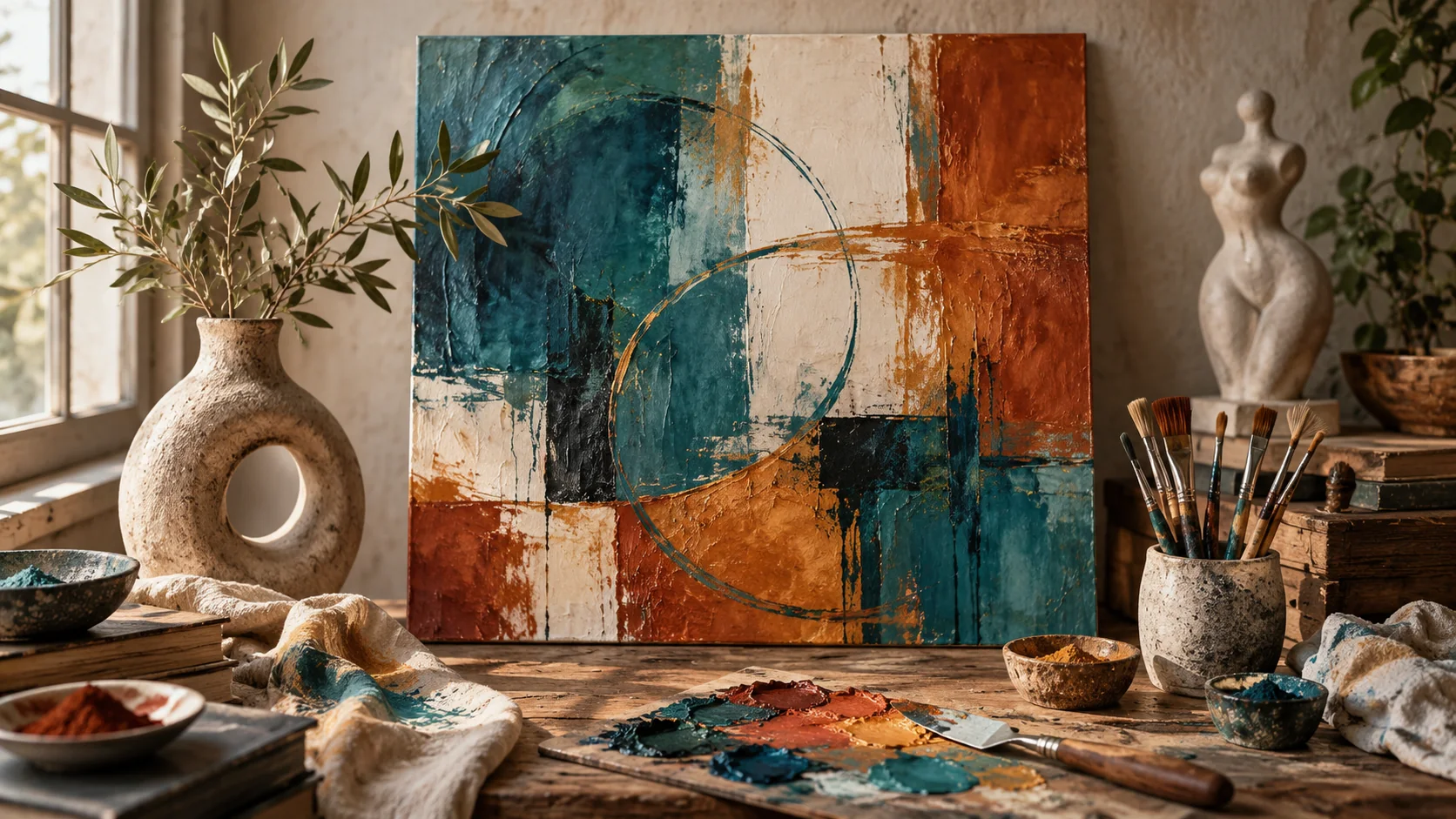
The principles of art describe how visual elements work together. Line, shape, color, value, texture, form and space are the material; balance, contrast, emphasis, movement, rhythm, proportion and unity help organize it. Lists vary between courses, but the practical task is the same: make deliberate relationships within the image.
Read an image through its relationships
| Principle | Question to ask | A change you can make |
|---|---|---|
| Balance | Does one side carry too much visual weight? | Move or quieten a competing shape |
| Contrast | Can you distinguish the important forms? | Separate light and dark values |
| Emphasis | What should the viewer notice first? | Give one subject a stronger difference |
| Movement | Where does the eye travel next? | Adjust lines, spacing or repeated directions |
| Rhythm | What repeats, and how does it vary? | Change the interval or size of recurring shapes |
| Proportion | Do sizes support the intended relationship? | Alter subject-to-background scale |
| Unity | Does the image feel connected? | Repeat a selected color or shape language |
| Variety | Is there enough difference to sustain interest? | Add a controlled exception to the pattern |
These are prompts for observation, not a scoring system. An intentionally unstable composition can be effective when that instability supports the subject.
Worked exercise: one vase, three decisions
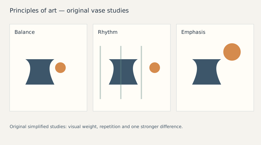
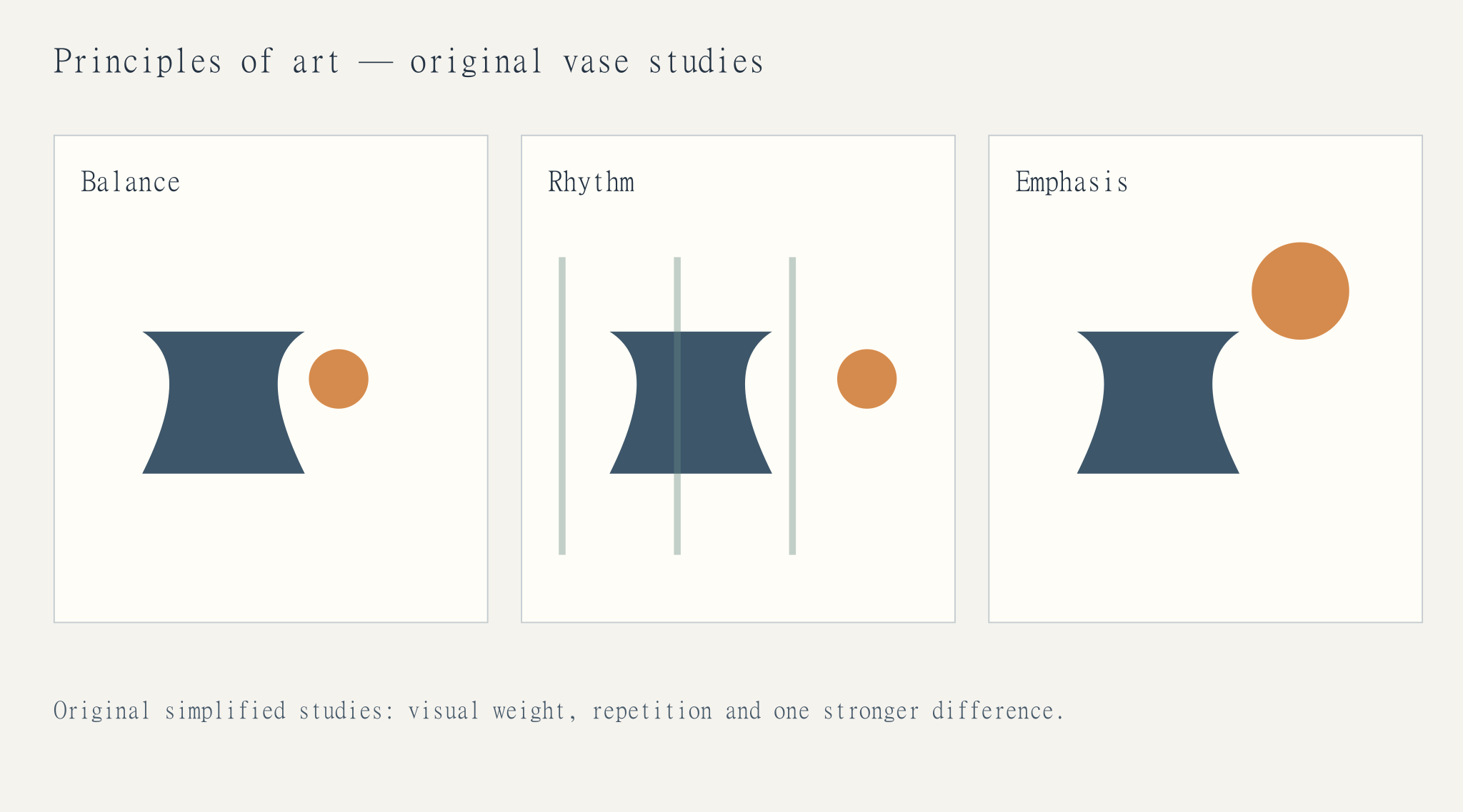
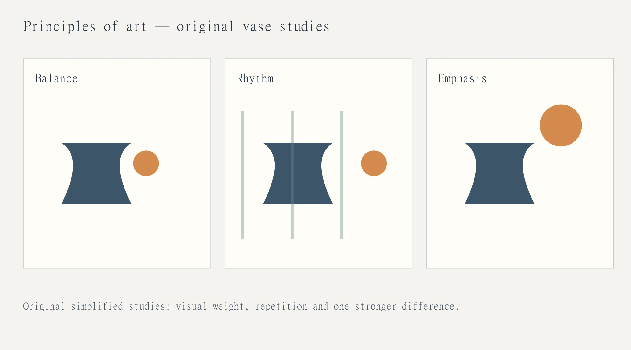
Draw a dark vase on the left of a light rectangle. Add a small bright circle on the right. The larger vase and smaller bright circle can balance because visual weight comes from contrast and position as well as area. Now move the circle close to the vase. The same two objects may feel heavier on the left, without either object changing size.
Next, repeat three narrow lines behind the vase. Even spacing creates a regular rhythm. Wider intervals toward the right can suggest movement or a pause. Keep the lines weaker than the vase if the vase is meant to remain the subject.
Finally, repeat the circle's color in a tiny part of the vase. That connection can create unity. Add too many equally bright circles and the focal point may become unclear. Variety works best when it has a relationship to the whole.
Use the principles while making images
Choose one intention before changing the composition. If the subject needs emphasis, inspect the value difference around it. If a layout feels disconnected, inspect repeated shapes or colors. If the eye leaves the frame too quickly, look at the direction of the strongest line.
Do not try to maximize every principle at once. A quiet image can use low contrast and little movement, while a lively poster may depend on strong rhythm and variety. The intended response determines which relationships matter most.
Review without inventing a rule
View the image small, in grayscale and at normal size. Identify the first subject, the next visual step and any competing detail. Ask whether that sequence supports the image's purpose. Make one change, compare the versions and describe what actually changed.
Use Cuta's image workspace to explore a composition, but write the relationship into the brief: “one dominant vase, quieter repeated lines, a small balancing accent.” That gives you a clearer basis for review than asking for an image with good design principles.
Read one composition through three decisions
Take a still life with a dark vase, a small orange fruit and a pale wall. Balance asks how their visual weights relate. Rhythm asks whether repeated curves or intervals give the eye a route. Emphasis asks which difference makes one element the first thing you notice. The same objects can illustrate all three principles without requiring three unrelated definitions.
Draw a small thumbnail before changing the painting. Move the fruit farther from the vase to examine balance. Repeat one curve to explore rhythm. Increase a single value difference to change emphasis. Label the actual decision beside the thumbnail; that turns a vocabulary exercise into a usable compositional tool.
| Principle | Change in the vase study | Observation |
|---|---|---|
| Balance | Move the fruit toward or away from the vase | Describe visual weight |
| Rhythm | Repeat a curve at controlled intervals | Trace the viewing route |
| Emphasis | Strengthen one value or size difference | Name the first noticed element |
Download the art principles annotation sheet as an editable CSV. Fill the observation column with your own project notes.
Download the visual resources
SVG preserves editable vectors. PNG and WebP provide raster exports.
Remove example guides before publishing. Live text may use a fallback font.
Template dimensions follow this guide’s cited references. Layout guides are illustrative; confirm platform crops and printer specifications.