Maroon vs Burgundy: Hex Values, Undertones and Design Examples
Compare CSS maroon #800000 with the selected burgundy #800020 reference, then see how each color works in the same design.
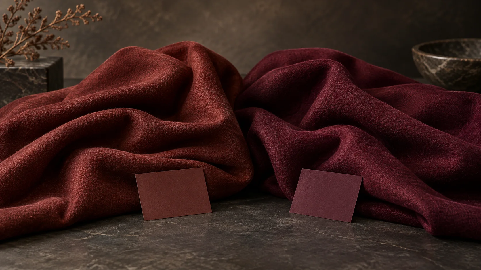
Maroon usually suggests a brown-leaning dark red, while burgundy suggests a cooler wine red with a purple note. The names are not reliable substitutes for a swatch. CSS defines maroon as #800000; this guide uses #800020 as a burgundy reference. Other design systems may assign burgundy a different value. CSS named colors.
Compare the same layout
| Reference | Hex | RGB | Practical character |
|---|---|---|---|
| CSS maroon | #800000 | 128, 0, 0 | Deep red with a restrained, warm appearance |
| Selected burgundy | #800020 | 128, 0, 32 | Similar depth with an added blue component |
| Shared paper | #F3E8D7 | 243, 232, 215 | Warm light field for either version |
| Shared text | #2D2421 | 45, 36, 33 | Dark anchor for small information |
RGB makes the difference explicit: the burgundy sample adds blue while retaining the same red and green values. That does not mean the perceived difference will be identical on every screen. Surrounding colors, illumination and finish affect the comparison.
Version A: maroon for a bookshop card
Use maroon as a broad band across a cream card. Set the shop name in cream and opening hours in the dark neutral below. Pair it with a restrained tan illustration of an open book. The warm paper keeps the red from feeling harsh.
Now put the same maroon next to bright tomato red. It can appear browner by comparison. Next to a dusty brown, it can appear more red. Judge the color inside the intended design rather than alone in a picker.
Version B: burgundy for the same card
Duplicate the card and change only the maroon band to #800020. Keep the title, spacing and illustration unchanged. Add a small muted pink label, then compare the two versions at the size the card will actually be used. Burgundy may support that pink more naturally, while the maroon version may sit more comfortably with warm tan.
This is a worked design comparison, not evidence that one color performs better. Choose according to the surrounding assets and the intended mood.
Pairings that give each color a clear role
Try maroon with cream, tan and a subdued blue-gray. Keep maroon as the primary field and use the blue-gray only for secondary information. For burgundy, try ivory, muted rose and forest green. Use ivory to separate the two dark colors; placing green text directly on burgundy can erase the letter shapes.
Neither reference makes a good small text color on a similarly dark photograph. Put information on a plain panel, or change the background value. A palette needs a readable dark-light relationship, not only attractive hue names.
How to hand off the selected red
- Record the exact hex value and its role in the layout.
- Keep one approved swatch beside product or portrait photographs.
- Ask the printer for a proof when paper or fabric must match.
- Specify any spot-color reference separately; do not infer it from this screen code.
- Approve the whole layout under the expected viewing conditions.
If the choice still feels unclear, make the two cards with the same photograph and typography. A controlled comparison is more useful than debating the color names. Use Cuta's image workspace to explore a supporting visual, and retain the exact brand swatches in the finishing file.
Compare the reds against the actual material
A warm brown-red may suit a leather notebook while a cooler wine-red gives a different relationship to ivory stationery. The names maroon and burgundy are not sufficient production instructions. Place the chosen values beside the real paper, fabric or product reference and preserve the codes in the specification.
For an invitation, use the deeper red for the heading or border and keep long details on a light surface. If the design will be printed on tinted stock, approve the result on that stock. A monitor comparison between two swatches cannot account for the paper underneath the ink.
| Comparison | Keep constant | Observation |
|---|---|---|
| Warm maroon route | Ivory background and dark body text | Record warmth beside the material |
| Cooler burgundy route | Same title, spacing and paper reference | Record the changed color relationship |
| Printed sample | Actual stock and printing process | Note approved reference value |
Download the maroon and burgundy comparison as an editable CSV. Fill the observation column with your own project notes.